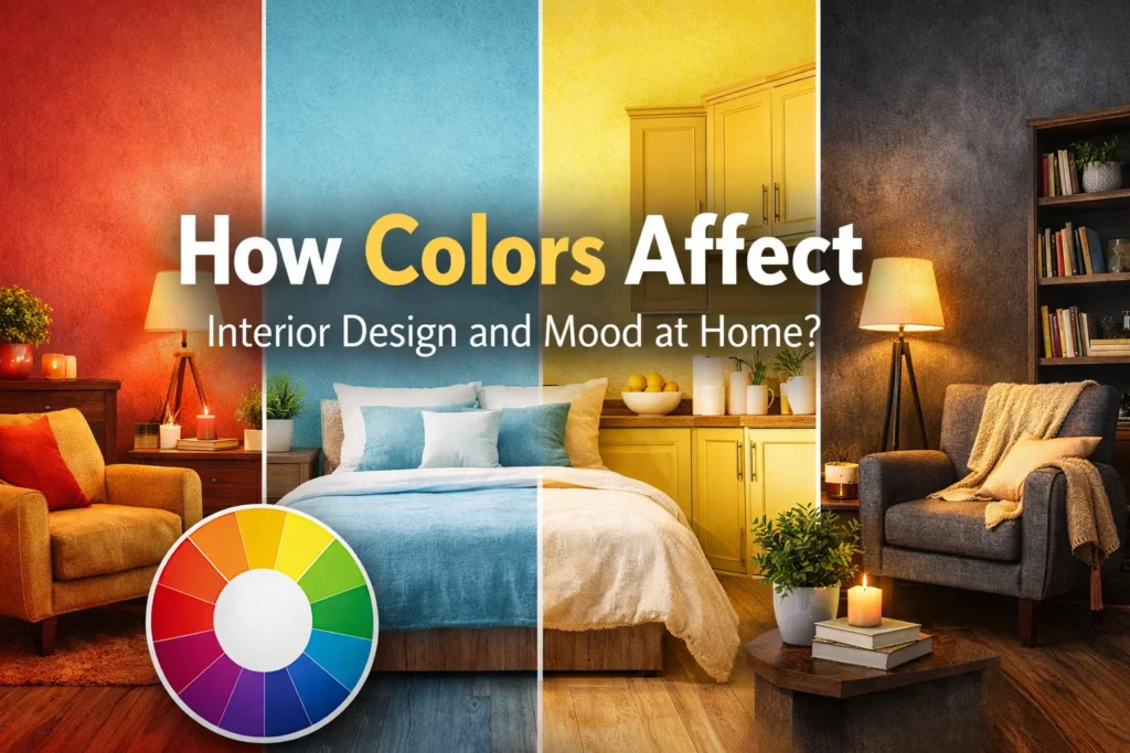
Introduction — Why Color Matters More Than You Think
Have you ever walked into a room and instantly felt calm, happy, or even uncomfortable? This feeling is not random—it’s the power of color psychology at work. The colors used in your home play a major role in shaping your mood, energy, and overall well-being.
Color is more than just decoration. In interior design, it directly affects how a space feels and how you experience it every day. The right shades can create a peaceful environment, boost your mood, improve focus, or make your home feel warm and inviting. On the other hand, poor color choices can make a space feel dull, stressful, or overwhelming.
Understanding color psychology in interior design helps you make smarter choices for your home. Whether you want a relaxing bedroom, an energetic living room, or a productive workspace, colors can help you achieve that goal.
The Psychology of Colors in Interior Design
Color psychology in home decor explains how different colors affect the human brain. When you see a color, your brain reacts in a certain way. Some colors make you feel calm, while others give you energy.
Warm colors like red, orange, and yellow are often linked to energy and excitement. These colors can make a space feel lively and active. On the other hand, cool colors like blue and green are known for their calming effect. They help create a peaceful and relaxing environment.
Neutral tones such as white, beige, and gray are also very important in interior design. They help balance strong colors and make a room feel clean and simple. These mood-enhancing colors are often used to create a calm and comfortable space without too much distraction.
How Different Colors Influence Mood at Home
Different colors can change how you feel in a room. Red and orange tones are strong and bold. They can increase energy and even make people feel more active. These colors are often used in spaces where people gather and talk.
Blue and green shades are calming colors for home use. They help reduce stress and create a relaxing feeling. Many people choose these colors for bedrooms or quiet spaces because they support mental peace.
Yellow and soft pastel colors are linked to happiness and positivity. They can make a room feel bright and welcoming. These colors are great for areas where you want to feel cheerful.
Dark colors like black, navy, or deep brown can add depth and style. However, if they are used too much, they can make a room feel heavy or smaller. It is important to use them carefully to keep a balanced mood.
Choosing the Right Color Palette for Each Room
Each room in your home has a different purpose, so the color should match how you want to feel in that space. In the living room, colors should create comfort and encourage conversation. Soft warm tones or balanced neutrals work well here.
In the bedroom, the goal is relaxation and better sleep. The best colors for bedroom relaxation are soft blues, greens, and light neutral shades. These colors help your mind slow down.
The kitchen is a place of activity and energy. Warm colors like light yellow or soft orange can make the space feel lively and even improve appetite. At the same time, clean colors like white can keep the space looking fresh.
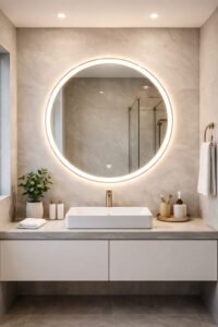
In the bathroom, people often want a clean and refreshing feel. Light colors such as white, pale blue, or soft green can create a spa-like atmosphere that feels calm and fresh.
The Role of Lighting in Color Perception
Lighting and color interaction play a big role in how a room looks. The same paint color can look very different depending on the light. Natural daylight shows the true color more clearly, while artificial light can change its tone.
Warm lighting can make colors look softer and more yellow. Cool lighting can make colors look brighter or slightly blue. This is why it is important to check paint color under different lighting before making a final choice.
A simple way to avoid mistakes is to test a small paint sample on your wall. Look at it during the day and at night. This helps you see how the color really feels in your space.
Modern Color Trends in Interior Design (2026 Update)
Interior color trends in 2026 focus on comfort and nature. Many modern home color schemes now include earthy tones like brown, olive green, and soft beige. These colors connect the home with nature and create a peaceful feeling.
Biophilic design colors, inspired by nature, are also becoming popular. Shades of green, natural wood tones, and soft blues help bring the outside inside.
Some people prefer minimalist styles with simple and soft colors. Others like bold and rich colors to make a statement. Both styles can work well if used carefully to support a positive mood.
How to Use Color Combinations Effectively
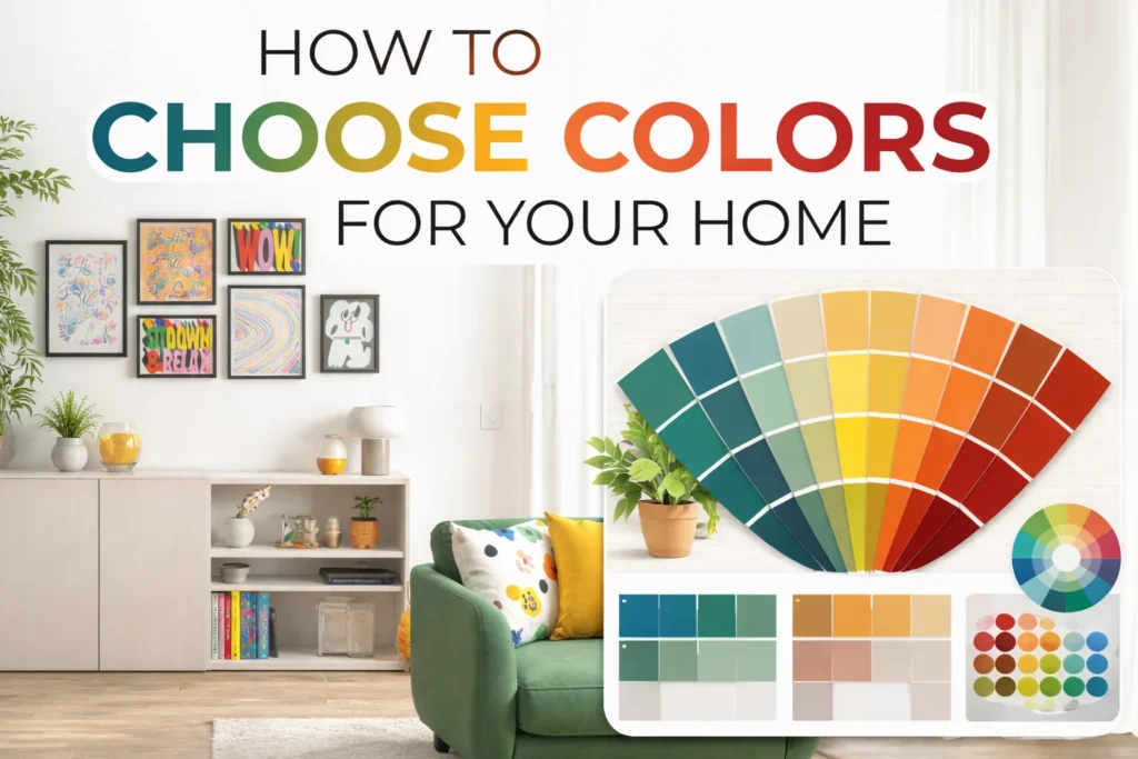
Choosing the right color combinations for home design is important for balance. The color wheel helps you understand which colors look good together. Some colors naturally match, while others create contrast.
A monochromatic scheme uses different shades of the same color, which creates a clean and simple look. An analogous scheme uses colors that are next to each other on the color wheel, giving a soft and smooth feel. A contrasting scheme uses opposite colors to create a bold and eye-catching design.
It is important not to mix too many colors in one space. Too many strong colors can make a room feel confusing and uncomfortable. Keeping a simple and balanced palette helps create harmony.
The Impact of Color on Small vs Large Spaces
Colors for small rooms should help the space feel bigger and more open. Light colors like white, soft gray, or pale blue reflect more light and make the room feel larger.
In large spaces, dark colors can be used to create a cozy feeling. Deep shades can make a big room feel more comfortable and less empty.
Using space-enhancing color ideas like painting one wall a different shade can also change how a room feels. These simple tricks help improve the look and feel of any space.
Cultural and Personal Influences on Color Choices
Personal color preferences are different for everyone. Some people feel happy in bright spaces, while others prefer calm and soft tones. Your culture can also influence how you see colors. In some cultures, certain colors have strong meanings and emotions.
It is important to find a balance between design rules and personal taste. Your home should reflect your personality. Choosing colors that you feel connected to will make your space more comfortable and meaningful.
Practical Tips to Choose the Perfect Colors for Your Home
When choosing colors, it is always a good idea to test paint samples first. This helps you see how the color looks in your real space. You should also think about your furniture, flooring, and decor before picking a wall color.
Home color planning tips include creating a smooth flow from one room to another. This makes the whole home feel connected and balanced. Choosing colors that work well together helps create a peaceful environment.
Common Mistakes to Avoid When Using Colors in Interior Design
Many people make simple mistakes when choosing colors. One common mistake is using too many bold colors without balance. This can make a room feel too busy.
Another mistake is ignoring lighting conditions. A color that looks good in a store may look very different at home. It is also not always a good idea to follow trends without thinking about long-term comfort.
Avoiding these interior design color mistakes will help you create a space that feels right for you.
Conclusion — Creating a Mood-Enhancing Home with the Right Colors
Now you understand how colors affect interior design and mood at home. Colors are powerful and can change how you feel in your space every day. The right choices can bring calm, energy, or happiness into your home.
It is important to choose colors carefully, test them, and think about how they make you feel. With the right balance, you can create a home that supports your mood and well-being.